Three Big Website Do’s and Don’t’s
How many times have you visited a website, waited for the landing page to load and been utterly disappointed in what you see? There are so many awful websites out there, from the layout to the navigation, the color pallet to the content. These websites are so terrible, it’s an absolute wonder how these websites are actually up and running.
Whenever we see an appealing, functional and impressive website, we get a happy feeling. Good website design does not require thousands of dollars to create either. Sure, it helps to have funding to back a website, as this will enable you to have superior functionality and awesome features, but it’s not imperative.
There are tons of hosts that allow you to create easy-to-use, appealing, functioning and affordable (or free!) websites such as wordpress or wix. However, before investing time and effort in these hosts, we recommend doing some research to ensure that they are the optimal solution for your website needs.
Need a bit of help getting started? We’ve come up with three major Do’s and Don’t’s for website design:
DO and DON’T #1
Opt for a layout and navigation that is simple, easy-to-use and clear. This will ensure that users can easily access and browse your site. A complicated navigation and layout causes confusion and will likely end in the user closing the tab on your webpage. One of the best examples we’ve found of a clear and easy-to-browse website is the Fabulous Bingo website. Important to note, the use of one major bright color helps the page pop and makes it aesthetically pleasing.

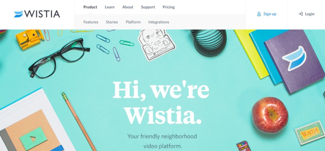
DO and DON’T #2
Choose a colour scheme that speaks to your brand. Bright, bold, complimentary colours give the feeling that your brand is welcoming, fun and vibrant. The folks over at Wistia have got this down to a tee. Their website has a strong visual appeal which makes you want to search for more content.
Avoid throwing in colors or imagery that is irrelevant. If you need to make a corporate website, it’s probably not the best idea to have brightly colored flowers and rainbows thrown across the page.
DO and DON’T #3
Content is key. Websites need to be informative, while still maintaining the user’s attention. Avoid placing reams and reams of copy on your website, as no one is going to read it. Rather opt for crisp, concise and clear copy (the three C’s) that helps keep users on your webpage. Got a lot to say? Give viewers the option to download information, as opposed to squashing it all onto your website. Remember that your audience is more likely to respond to visual cues, so make sure you’re saying what needs to be said, perhaps through a diagram, flowchart or by using icons.
Stick to these recommendations and we’re sure that you’ll have lots of quality web traffic.
For more inspiration we recommend visiting The Webby Awards, where you’ll find some of the best websites created for 2016.
There are so many wonderfully designed websites out there – the one for your business could be one of them.
Happy designing!